
It's not you, it's us.
Design can be a signal from companies that they no longer care about their customers.

There’s a bit of violence in a rebrand.
Not the bad ones, necessarily. Not the messy logo tweaks or off-center icons. I’m talking about the ones that feel like betrayal. A sharp pivot in tone, style, or symbolism that makes brand-fans stop and wonder….do you even know who I am?
Apple’s new design direction and Jaguar’s recent rebrand both triggered that feeling. Maybe for different reasons. But in both cases, the core emotional response is the same - feelings can be hurt.
Design Is a Relationship, Not a Coat of Paint
We talk about design as aesthetics. Colours. Logos. That kind of stuff.
But effective design is really relational. It’s a mirror brands hold up to their customers. It is the expression of the relationship between a company and the buyers of things. Customers that become fans because they feel understood and seen.
This is trust and safety built up over multiple product iterations. Consistently showing up for the user. Delivering on, and exceeding promises, at least most of the time.
When that mirror suddenly reflects something else — something colder, or flatter, trendier, more corporate, or more whatever — customers take notice. And often they can feel a bit hurt.
Psychologically, there’s dissonance. A mismatch between who we believed the brand was and who they’re telling us they are now.
That mismatch creates instant distrust.
A Shift with No Warning and Less Meaning
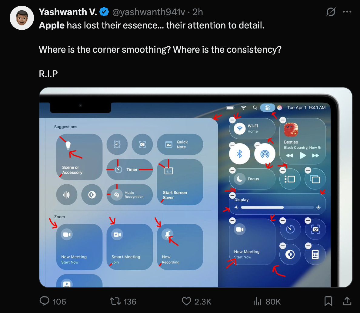
Apple’s newest UI changes, with the soft skeuomorphic shading and Aero-like glass, seems to have caught a lot of people off guard. Especially those who came of age during the Jony Ive era (and that’s all of us).
There are some fundamentally bad decisions in this design. But more than that, this seems like a step away from what Apple stands for. A move towards doing things because you can, not because you should. Adding complexity for it’s own sake, rather than finding simple solutions to difficult problems.
And when that happens we can’t help but think about where their products will be two or three years from now, and whether or not we want anything to do with them.

The emotional contract has been amended.
Apple used to be about clarity, precision, restraint. Now, with these new visuals, it’s hinting at something else. What, exactly, I can’t say.
The shift feels sudden and unearned. And when brands change without bringing their customers along, even small design choices read as betrayal.
The aesthetics matter in the sense that they are a signal to the customer. When the design works, it connects emotionally with the user. When it doesn’t work, the user is alienated. Whether or not that is a bad thing depends on the company and where it wants to go.
Jaguar: A Rebrand for a Customer That Doesn’t Exist
Then there’s Jaguar.

The new identity? Stark. Minimal. Gone is the leaping cat. Gone is the motion, the elegance, the swagger. In its place: haute couture filtered through mid-level agency creatives.
Personally I kind of dig it. It’s like a half-assed homage to Jean Paul Gaultier.
And the mark is sleek. Excellent balance and a sense of luxury.
The problem, in my view, is that is all that it is - this new brand could be for anything. A car, a handbag, a shoe line, a hotel, or a musical.
Everyone was up in arms about this rebrand. Jaguar was burning the customer relationship to the ground.
But here’s the thing. Jaguar’s customers broke up with them first. Sales were tanking. EV competitors were crushing them. China has been moving hard into the European market. The brand was drifting into irrelevance.
So when they rebranded, they weren’t redesigning for the customer. They were telling them not to let the door hit their ass on the way out.
And in that light, the rebrand actually makes sense. Jaguar wasn’t just refreshing the paint. They were burning the boats.
But that comes with a trade-off: if you abandon the emotional cues your loyalists loved you for, you better fully commit to wooing a new crowd. Half-measures don’t work in identity, and Jaguar failed because they failed to go all in.
Design for Humans
When founders understand their customers deeply — psychographically, not just demographically — their design choices show it. They build interfaces that feel intuitive, language that feels like home, symbols that say, we see you.
That’s not magic. That’s design as a reflection of the relationship. That’s understanding at a level beyond data. It’s being human.
Empathy in design is everything. As Jony Ive said, it’s a way to show the person opening the box that you give a shit about them. That someone out there cares enough to make their day a bit more delightful.
That is the essence of design, which should always be executed with humanist purpose.
You Can Change. Just Don’t Ghost Me.
Change isn’t the problem. Customers evolve. Markets shift. Cultural cues go stale. Design has to move because, while the meaning may never change, the expression must evolve to meet its context.
Successful design, then, is still an expression. It’s the reaffirmation of the current relationship, or the pursuit of a new one. We grab the audience by the hand and take them exploring, or we tell them it’s over and we’ve moved on.
But if you tell your customers you don’t want them anymore, don’t go crawling back.